WOOLWORTHS ESSENTIAL RANGE
Overview
Woolworths set out to redefine its value-tier private label, moving away from the dated Homebrand identity to create a more contemporary, trusted and engaging brand for everyday essentials.
The challenge was to develop a packaging system that aligned with the Woolworths master brand while establishing a distinctive identity that shoppers could instantly recognise across hundreds of products and multiple categories.
The Brief
Develop a scalable packaging design system that leveraged the Woolworths master brand while giving the new Essentials range its own distinctive personality.
The solution needed to:
Create a cohesive identity across the entire value tier.
Balance consistency with enough flexibility for individual product categories.
Reinforce value without compromising perceptions of quality.
Deliver a design system capable of expanding across hundreds of SKUs.
Creative Strategy
The brand voice was built around confidence, simplicity and honesty.
Rather than relying on exaggerated claims or promotional language, the packaging focused on clear communication and practical product information. Every design decision reinforced the idea that choosing Essentials was a smart, confident purchase—not simply the cheapest option.
The visual language reflected this philosophy through clean layouts, strong typography and bold, uncomplicated graphics that created standout while remaining unmistakably functional.
The IDea
The central creative idea was Simplicity.
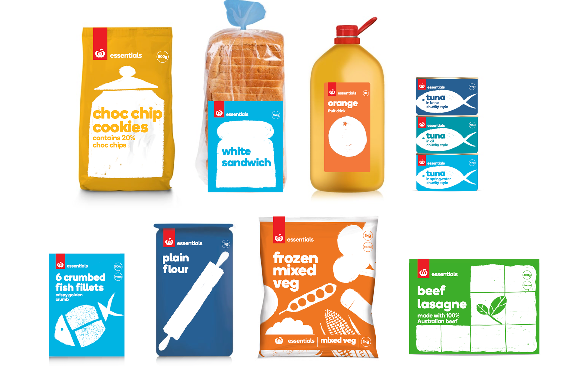
Each pack featured a bold illustration that distilled the product to its most recognisable form. These illustrations became a distinctive brand asset, bringing warmth, personality and memorability to the range without distracting from the product itself.
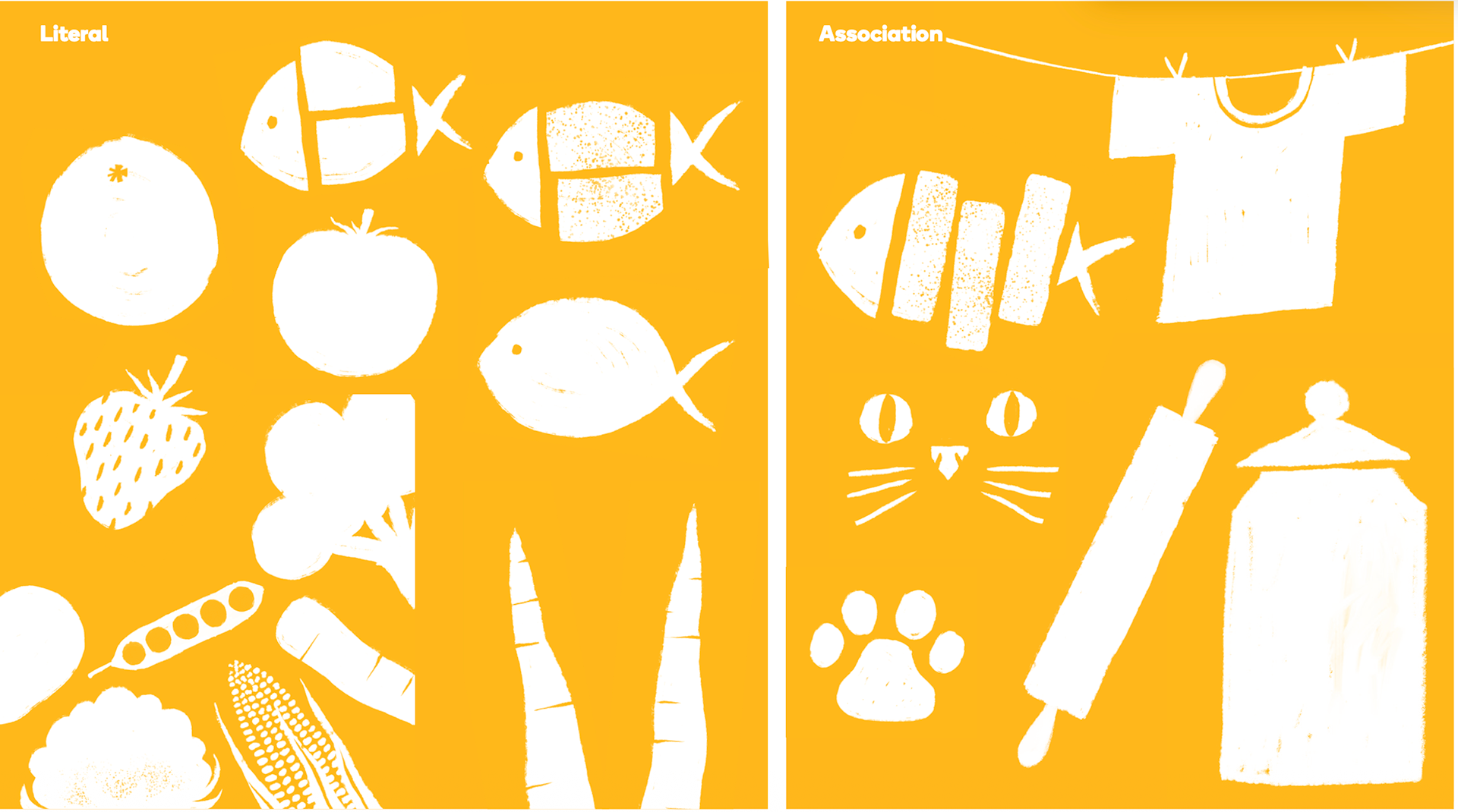
Depending on the product, illustrations followed one of two approaches:
Literal — a simple depiction of the product itself.
Associative — an expressive graphic that referenced the product through an intuitive visual metaphor.
The illustration style remained consistently bold, spirited and charming—never childish—creating a visual system that was instantly recognisable across every category.
The Outcome
The result was a cohesive packaging system that successfully transitioned Woolworths from Homebrand to Essentials, creating a modern value brand with stronger shelf presence, improved navigation and a more contemporary customer experience.
The flexible design system enabled consistent rollout across hundreds of products while strengthening recognition of the Woolworths private label portfolio and reinforcing the brand's promise of dependable everyday value.
ILLUSTRATION OVERVIEW

ICONOGRAPHY OVERVIEW

RANGE OVERVIEW